
Supply Chain Platform
Note: The project is under NDA, so unfortunately I can't share more details.
One design system and one set of UX patterns across 17 interconnected tools used to run pharmaceutical manufacturing and supply chain operations.
Manufacturing operations, with a set of digital products aimed at economy of scale, shorter throughput times and leaner inventories.
- Top 5 global pharma, revenue ~$50B
- Markets in 155 countries
- Enterprise UX for Business Services, streamlined processes in clinical trials & operations
What the Platform Is
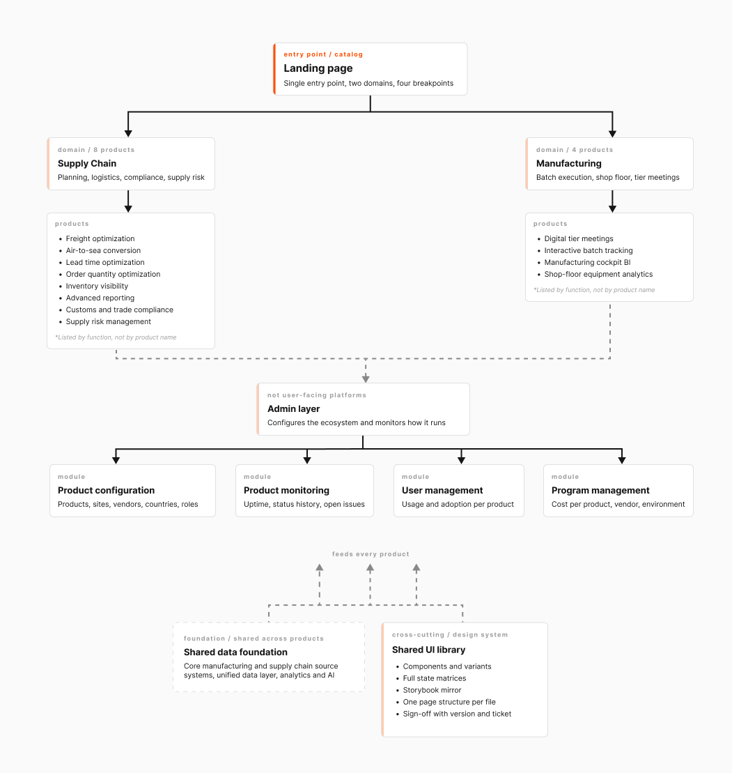
From the outside it reads as one product. Inside it has three layers.
The landing page. A single entry point where every product sits in a catalog, split into two domains: supply chain and manufacturing. People start their day there and stop keeping 12 bookmarks.
The products. 12 tools, from inventory and logistics planning to production batch tracking and shop-floor equipment analytics. Each has its own manager, its own team and its own users. What they share is the data underneath and the requirement to look like one system.
The admin layer. 4 modules nobody sees except the people who keep the platform running: configuration of products, sites, vendors and roles, plus monitoring of availability, usage and cost.
12 products, 4 admin modules and a shared library — that is where 17 comes from.
Problem
Every product was built by a different team, often through different vendors and years apart. Some are BI reports wrapped in a product shell. Some sit on a third-party data grid. Some are full operational interfaces where decisions get made within the hour.
The same task ended up solved three ways in three products. A filter was a dropdown here, a side panel there, a modal in the third. Anyone who opened 4 tools in a day relearned the interface each time.
And there was one designer for the whole ecosystem. Drawing every screen myself was never on the table — whatever I built had to keep working on the days I wasn't in the room.
Goal
A unified UX and a design system that scales:
- Keeps products consistent despite very different natures
- Reduces friction when people move between tools
- Speeds up delivery by reusing validated components
- Supports onboarding for both new users and new teams
Design System & Governance
Building the UI kit took a few weeks. Getting 5 teams to use it the same way took the rest of the year.
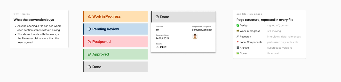
One structure for every file. All 17 files are built to the same layout: approved design, work in progress, research, local components, archive, cover. Readiness is carried in the page name as a prefix, so anyone opening a file can see which parts are settled and which are still moving.
A status card on every section. Each section carries a card from the day it starts: status, version, date, responsible designer, and a ticket number that links straight to the tracker. The status travels with the work — pending review, work in progress, postponed, approved, done. What is ready to build is settled with the team on the call and recorded in the ticket, and the card keeps the design side of it visible in one place.
Component maturity. Two independent statuses: design ready and implementation ready. That defuses the usual failure of a shared library, where a designer specs something that doesn't exist in production yet and the team commits to a date it can't hit.
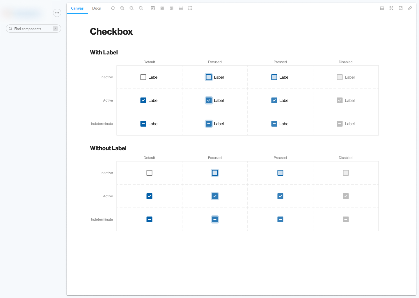
Full state coverage. Each component is documented as a matrix: types, hover, focus, disabled, icon variants, destructive, loading. Nobody has to ask what a secondary button with an icon looks like while loading — it is already drawn.
A mirror of Storybook. Documentation pages in Figma repeat the structure of the real Storybook. Designer and developer look at the same object from two sides, and the two versions stop drifting apart.
Key UX Decisions
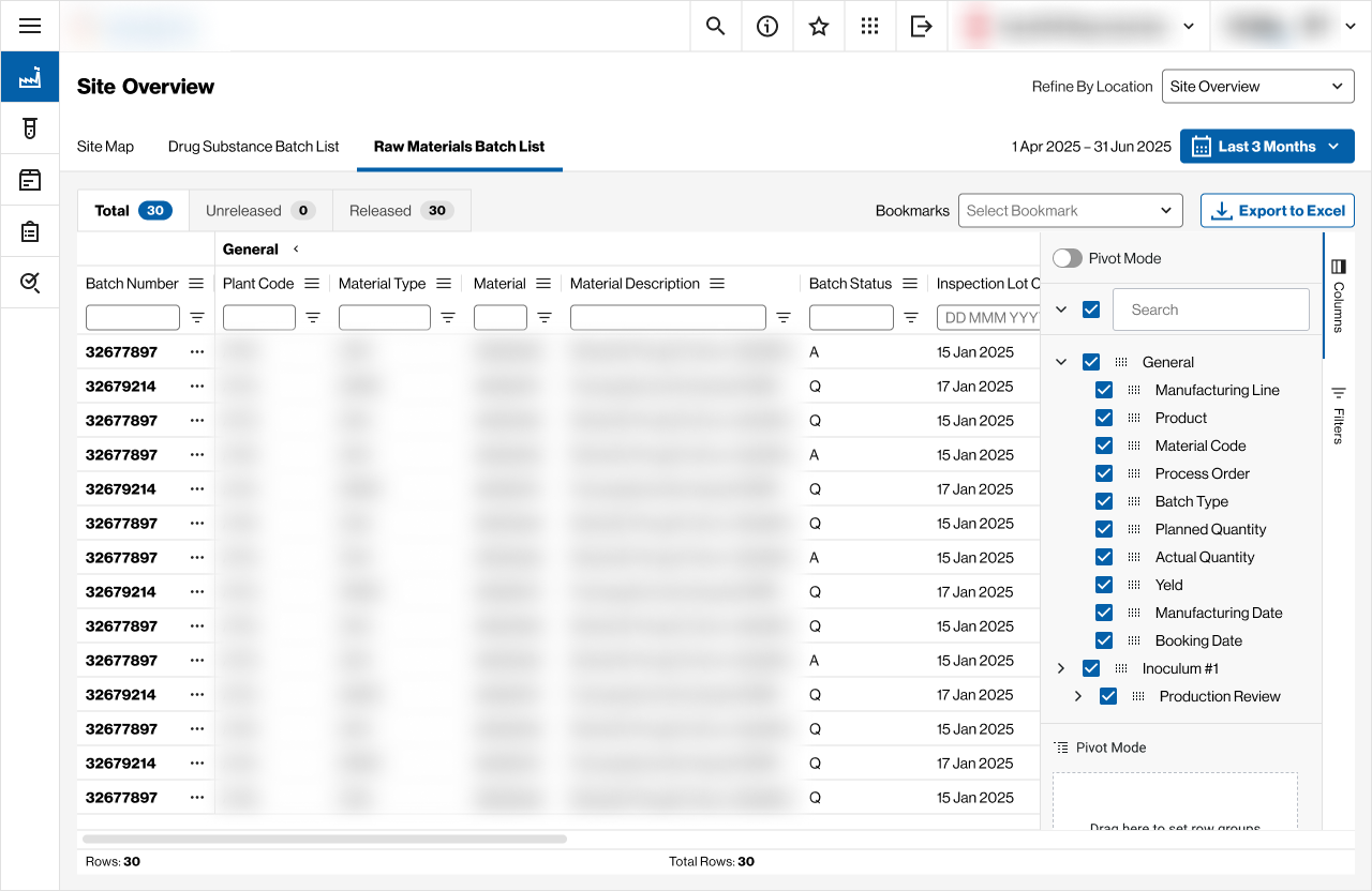
60 columns
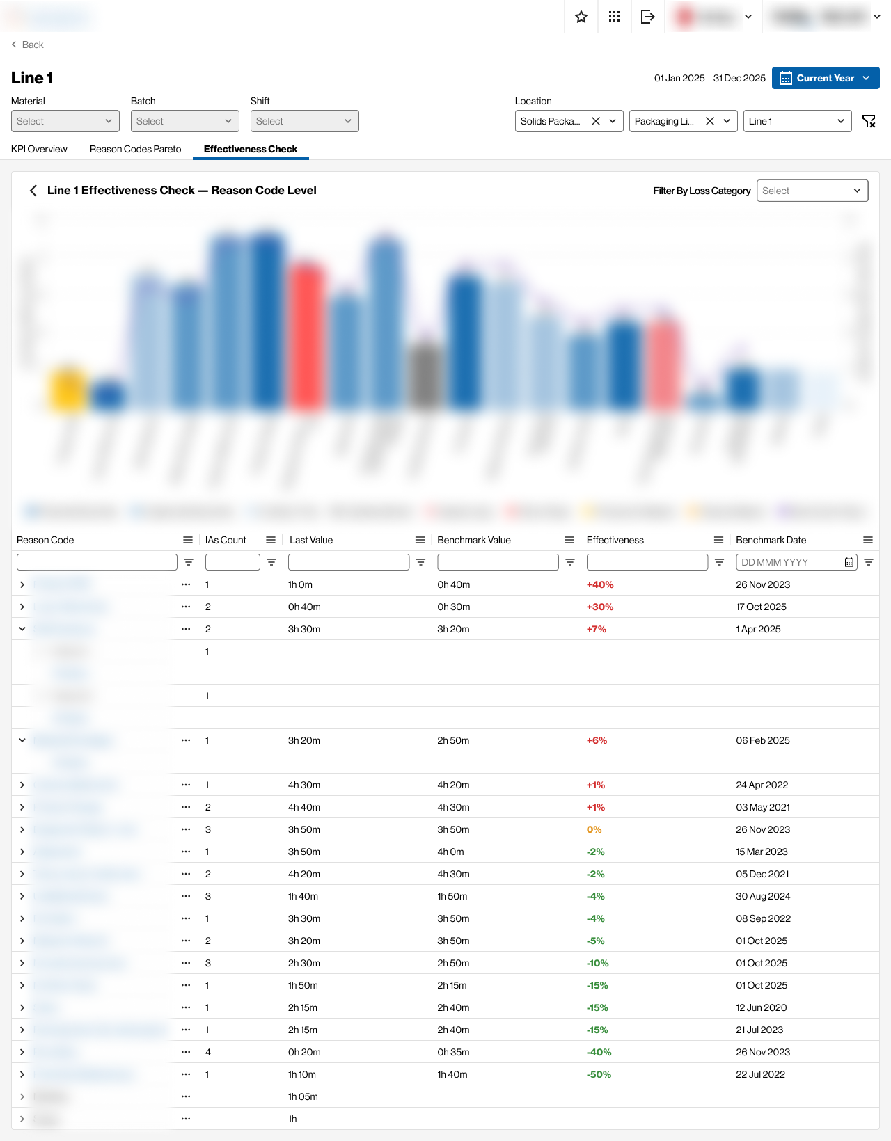
The batch tracking tool carries around 60 data fields in one table. Showing them is straightforward. The trouble is that every role needs a different 12 of them, and all 60 matter to somebody.
So the table ships with ready-made column sets per scenario: batch overview, quality assurance, lab control, production. People start from the set that matches their role and adjust from there. A separate layer handles visualization rules — overdue, priority, open deviations — and color has to carry the same meaning in every product, otherwise it stops carrying anything.
A registry for someone else's dashboards
Part of the analytics lived in a BI portal, and people got there through links in email. The reports themselves stayed where they were. What we added was a way to register them inside the product: a site admin adds a report, it opens in the interface, and the link lives in one place for the whole team.
The happy path took less than half the work. The rest went into the empty registry, the report that fails to load, missing permissions, a malformed link, the copy confirmation — states the user was never supposed to meet and will meet anyway.
A process that lived in SharePoint
Back-order escalation ran on a SharePoint list and a mail thread. The brief said “design a screen”, and a screen didn't get anywhere near the problem.
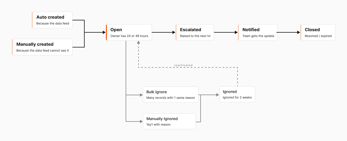
We started from what the escalation record actually is: who opens it, what happens to it, who is allowed to close it, what “ignore this risk” means and how it comes back. Out of that came a lifecycle — automatic and manual creation, ignoring with a reason, bulk ignoring, reactivation, escalation, notifications. The screens followed from there.
1 order, 5 roles
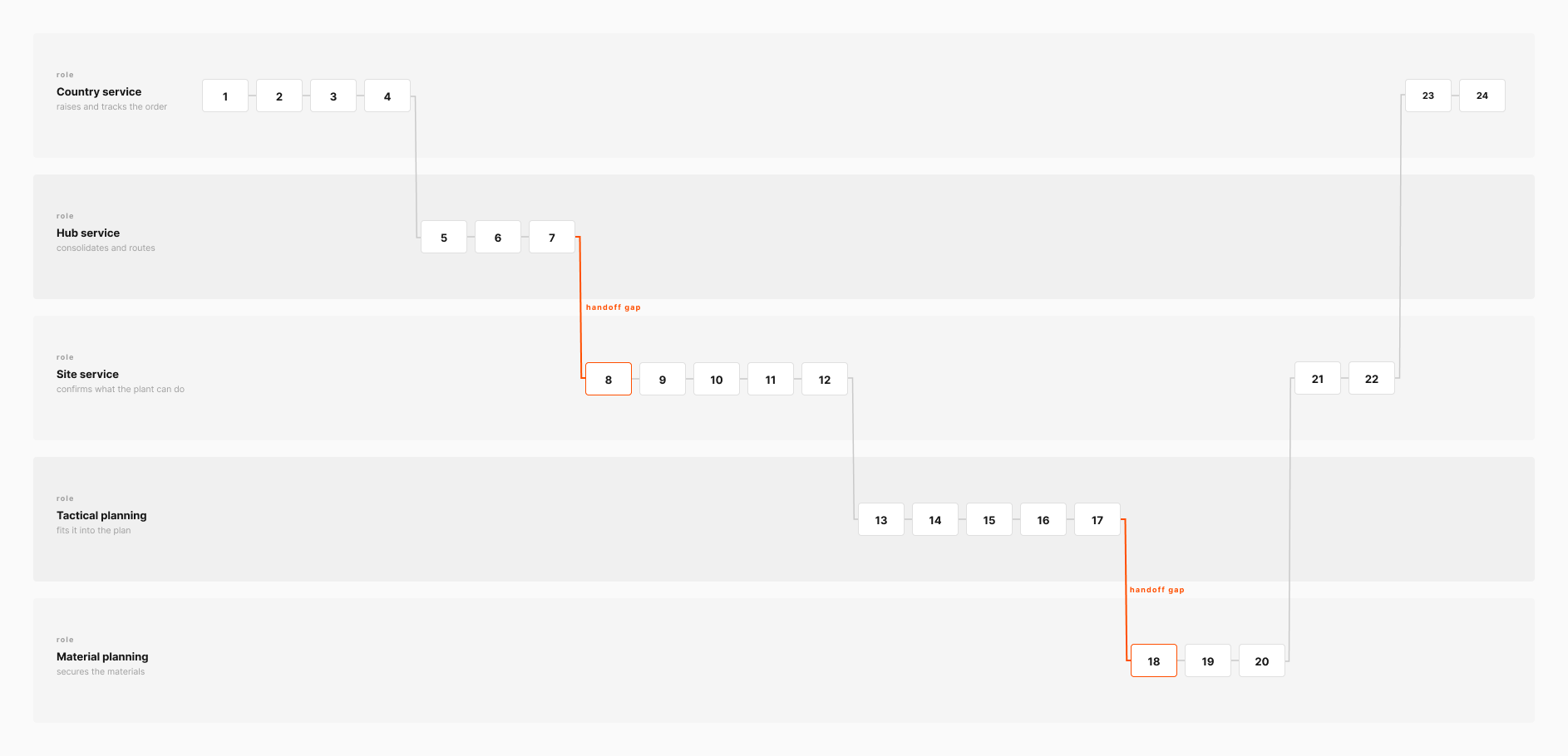
In the order tracking tool a single line travels through country service, hub, site service, tactical planning and material planning. Everyone sees their own slice and nobody sees the whole, so status gets chased by email.
The prototype ran as a 24-step sequence color-coded by role: at each step you can see who holds it and what the next person sees. It did more in a demo than any document — people saw the process end to end for the first time, including the two places where it fell apart.
Constraints
The design system was never the bottom layer here. Underneath it sat a third-party table component with its own rules and a BI platform with its own layout and typography. The job came down to finding the smallest set of rules that survives both cases: where the interface is entirely ours, and where we own only the frame around someone else's report.
Brand & Communication
Alongside the interfaces I handled how the ecosystem looks from the outside: product marks and the rules for using them, an architecture diagram for leadership, templates for decks, emails and internal pages, launch banners, and named certificates for the teams. An internal product with no recognizable name and no face reads to its users like one more email from IT.
Results
- Scalable UI: a shared component library and UI kit kept in sync with Storybook, plus Dev Mode and handoff plugins — fewer inconsistencies between teams.
- Scalable UX process: discovery sessions, surveys and regular demos across 5+ teams kept the work anchored to real usage.
- Collaboration: regular syncs, design reviews and handoff documentation shortened the iteration cycle and cut misunderstandings.
- Scores: User Satisfaction Score and CSAT both positive (exact figures under NDA).
One of the initiatives inside the ecosystem was recognized with an internal Operations Award — Culture in Action.